Seeking to rise as the pinnacle of design, decadence and status, One Sankari’s creative identity had to be as big and bold as the brand’s ambition.
Brand Strategy and Positioning
Brand Narrative
Brand Identity and Visual Language
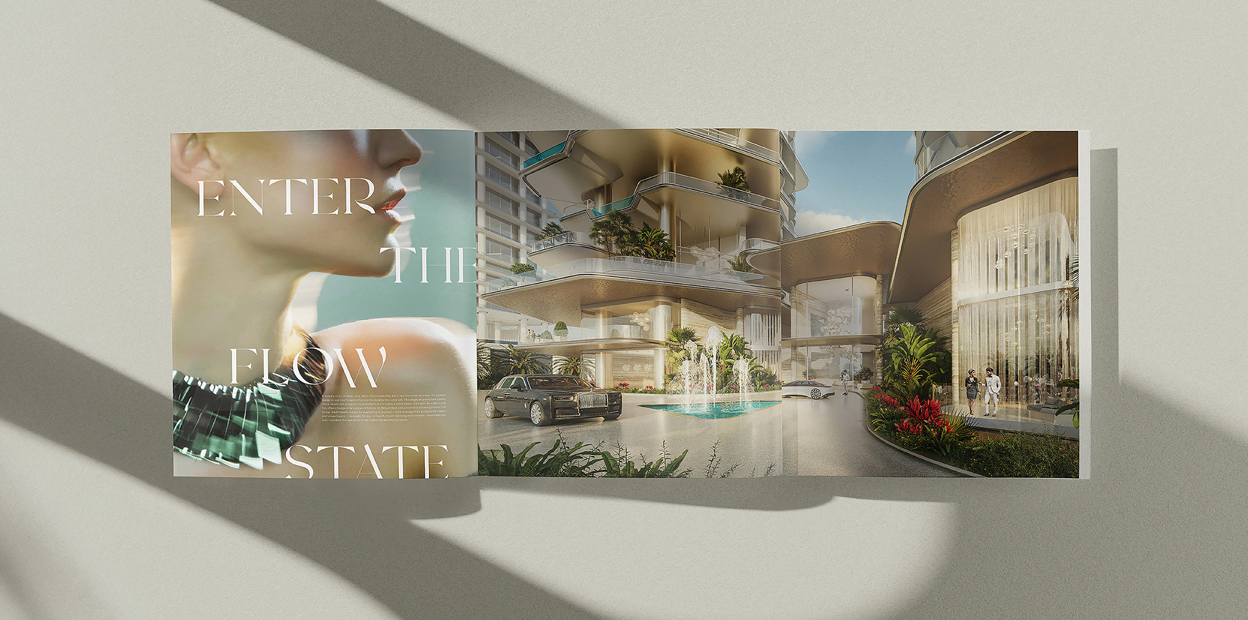
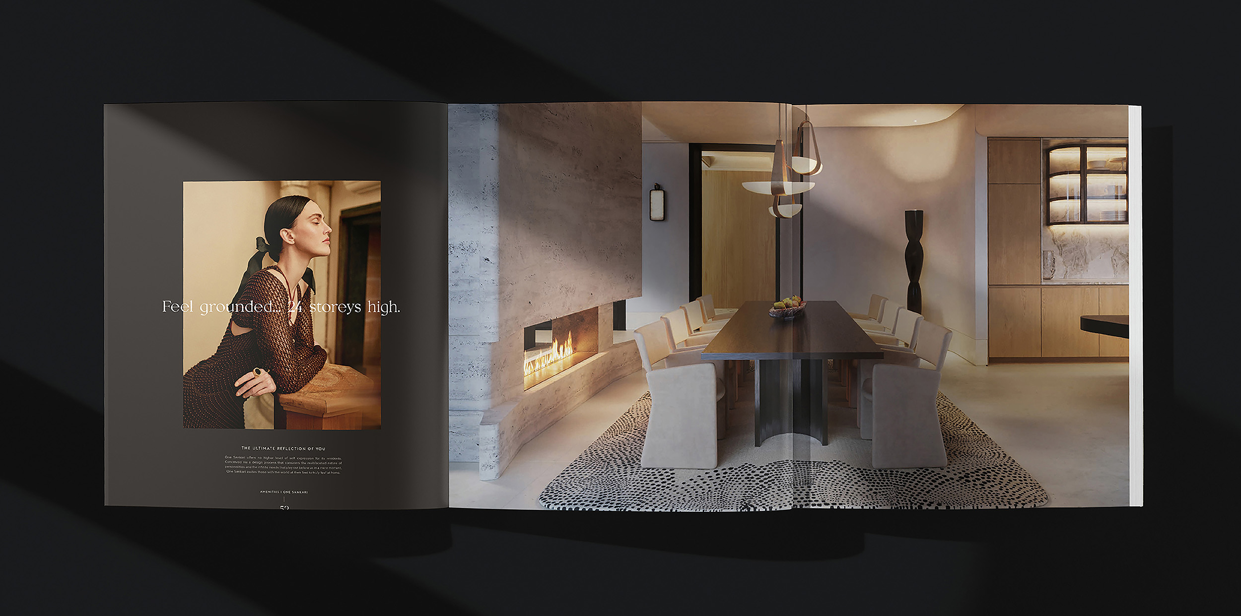
Brand Book
Print and Outdoor Campaign
Digital Campaign
Read more
One Sankari is a feat of residential design – ultra-rare residences on the waterfront that stand as the jewel in Dubai’s crown. Fifth Estate’s work on the comprehensive creative identity of One Sankari coincided with our creation of Sankari Properties’ master brand. Developing the two expressions concurrently afforded deep insight into the values that drove the creation of One Sankari, the brand’s masterpiece. This meant that each deliverable empowered the other, and we were able to showcase One Sankari as the living embodiment of Sankari Properties’ perpetual pursuit of perfection.
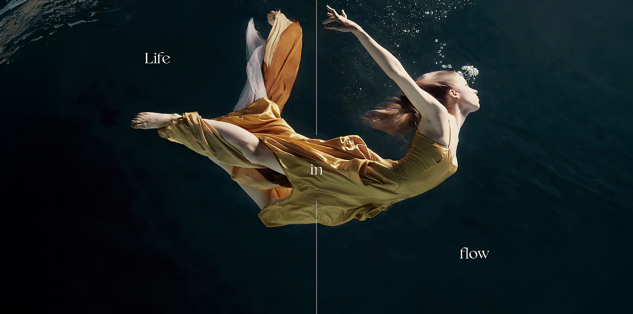
One of the foremost objectives in the development of this brand was to convey the ultra-elite status a One Sankari address represented, thereby reaching the exclusive audiences we were targeting. Our goal was to make the residences synonymous with luxury. Building from the strategic foundation of the brand, we crafted a creative identity and visual language that showcased One Sankari’s own embodiment of a new vernacular for the spectacular. Looking to the water feature in the central lobby, the sparkling harbour that illuminated its facade and the streamlined lifestyle that awaited residents, we sought to revere fluidity and showcase ‘life in flow’.
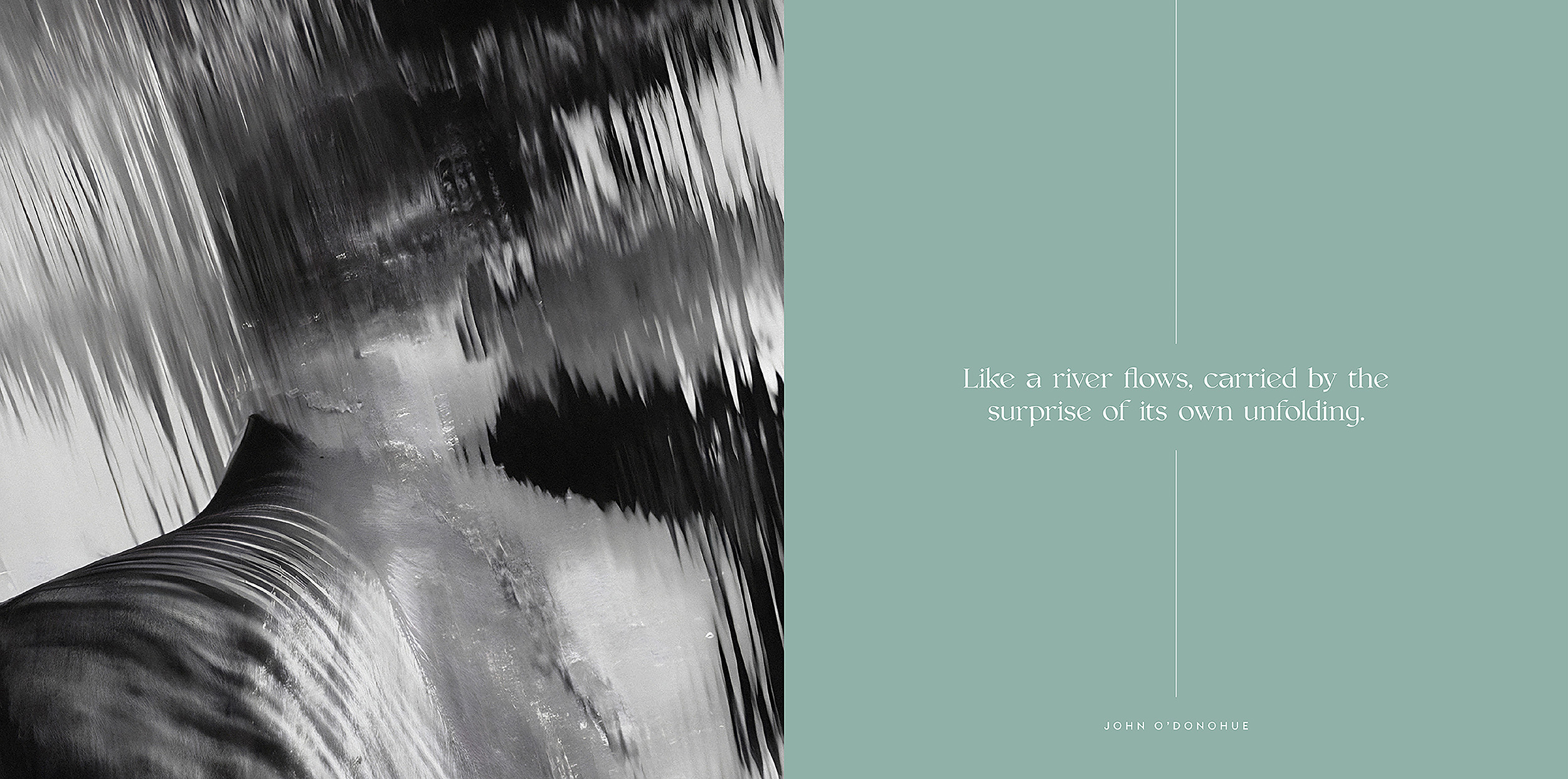
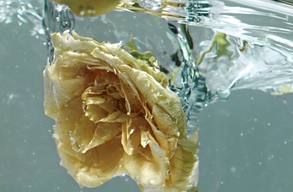
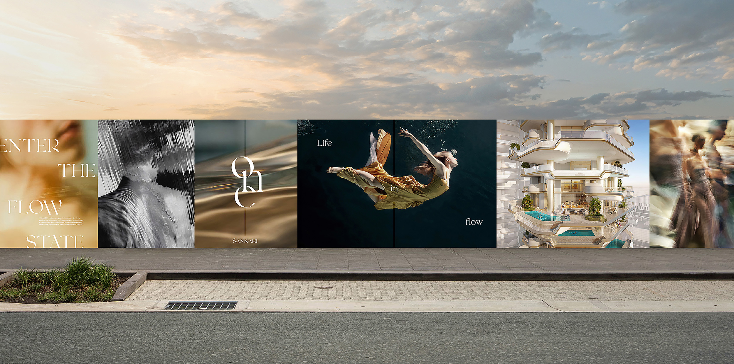
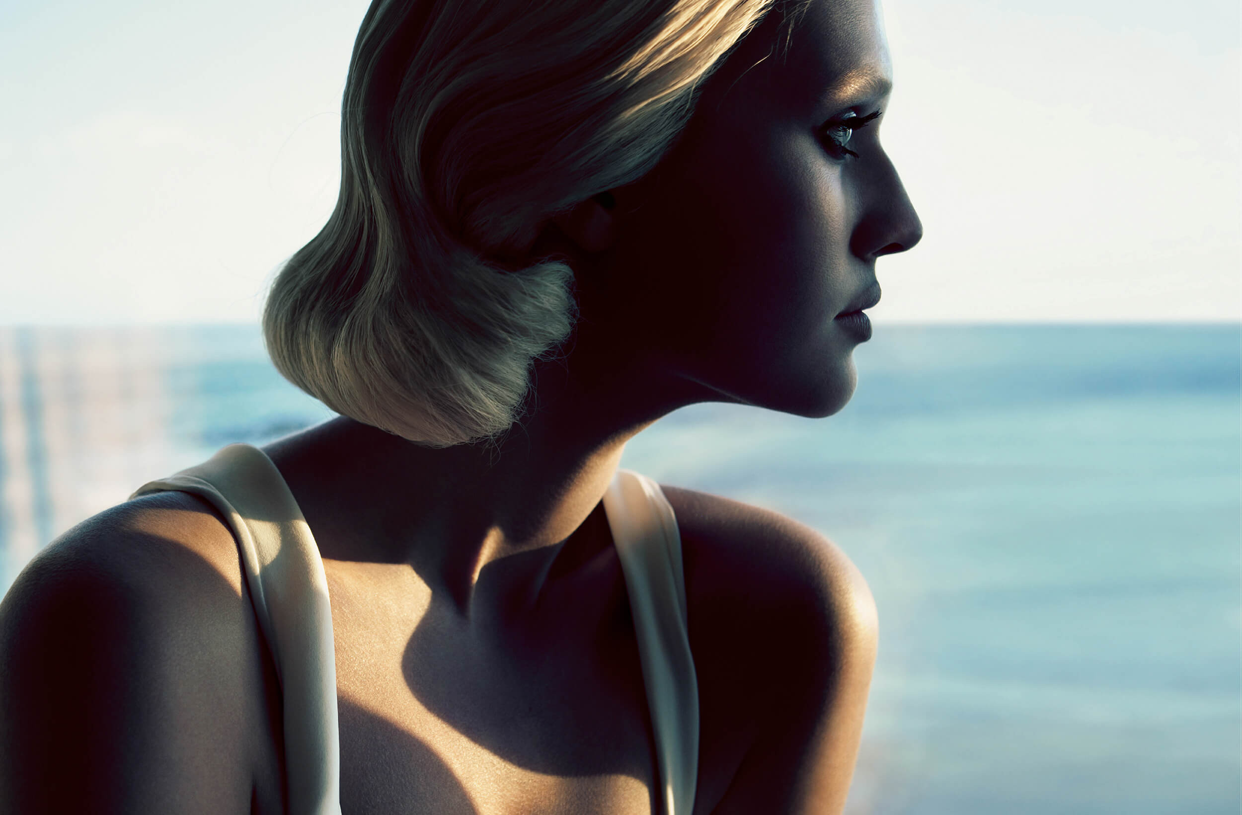
Our creative expression treated water as the muse that inspired One Sankari’s materialisation and honoured water and flow at every touchpoint. We highlighted the cascading flow of the building’s facade, the organic curves of the interiors and the lifestyle offering that afforded life gliding seamlessly. This was conveyed through a photography style that heroed water-focused imagery, as well as a colour palette rich with aqua-inspired fresh blues and calm greens. In this way, we were able to align One Sankari with a most precious element – water – thereby presenting it as an opulent oasis only reachable for the most discerning audiences.
Developer: Madinat Al Foutain, Oman
Through a rich creative identity inspired by the seamlessness and elegance of water, Fifth Estate presented One Sankari as a home where residents saw their greatest self reflected in its waters.
From the Source
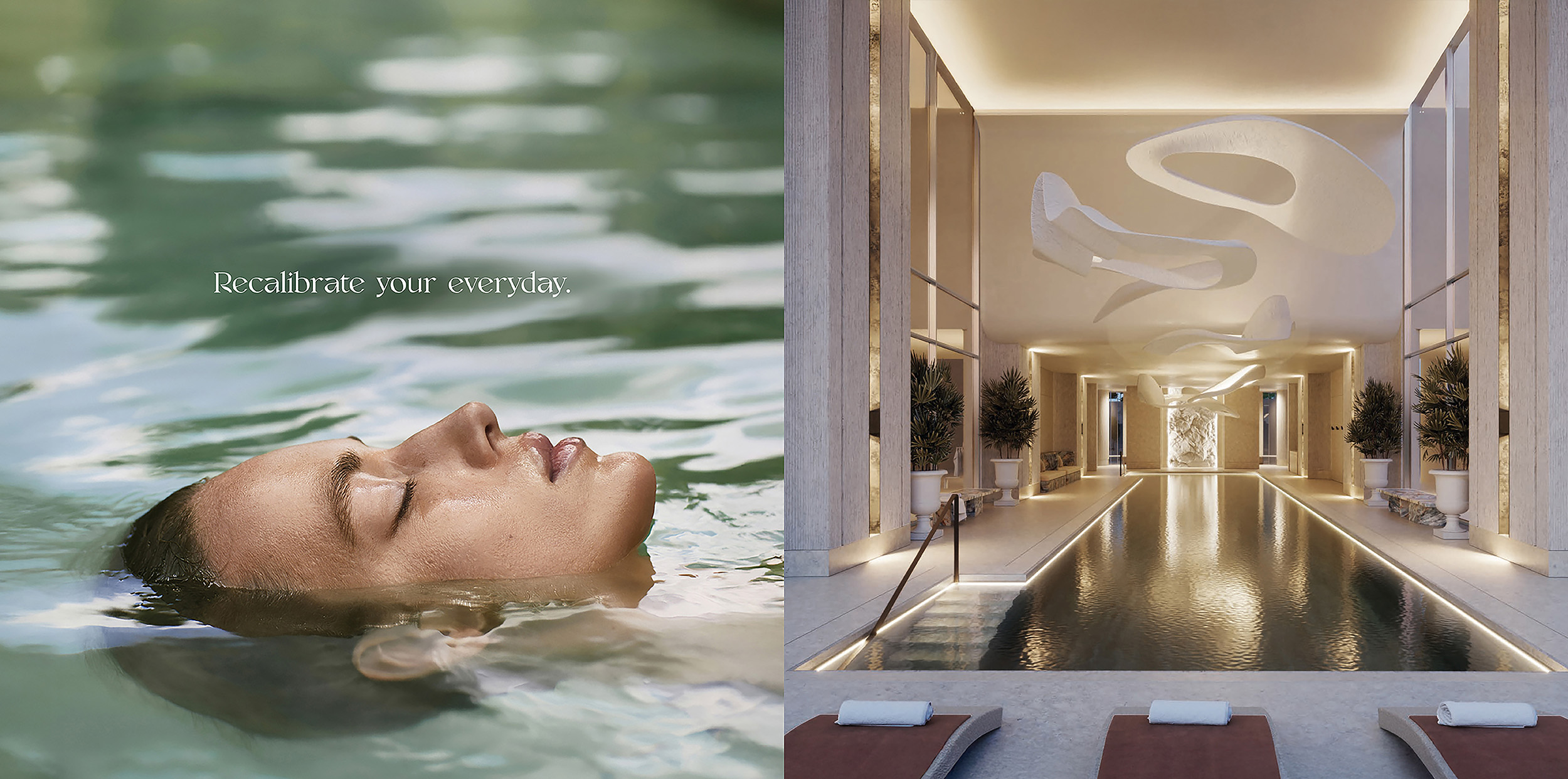
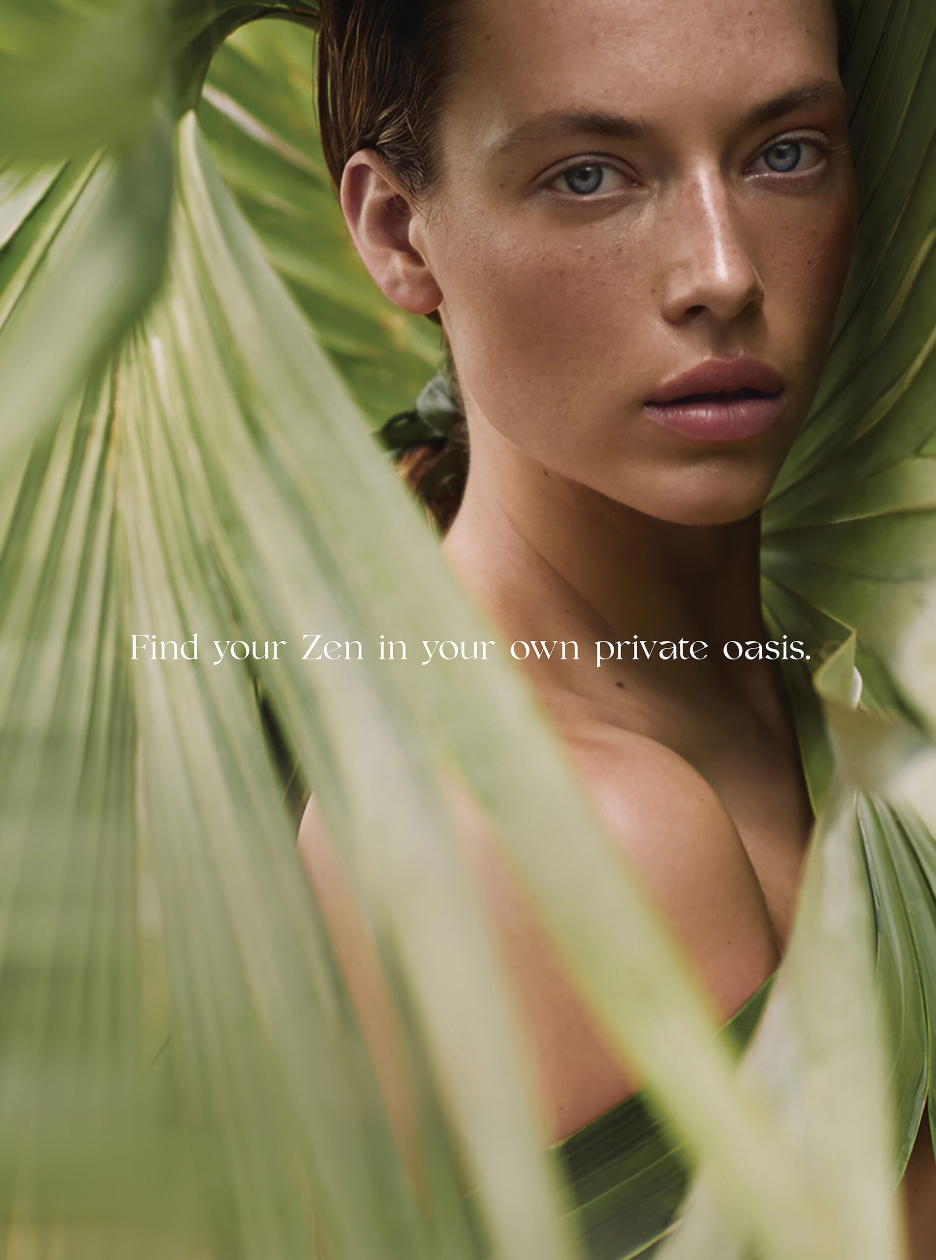
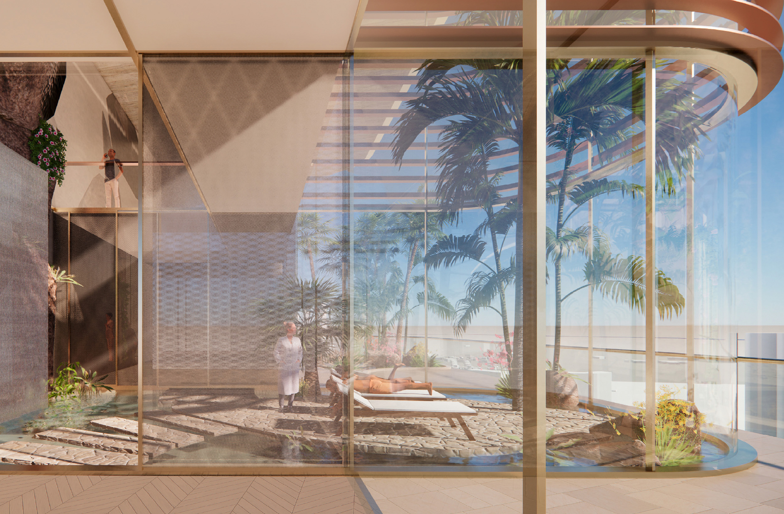
The creative direction we pursued also celebrated the restorative nature of water, allowing us to play up the incredible services on offer to all future residents. This gave us scope to showcase the amenities including indoor and outdoor swimming pools, health and wellbeing spa, and various gym and pilates options.
Flowing Typography
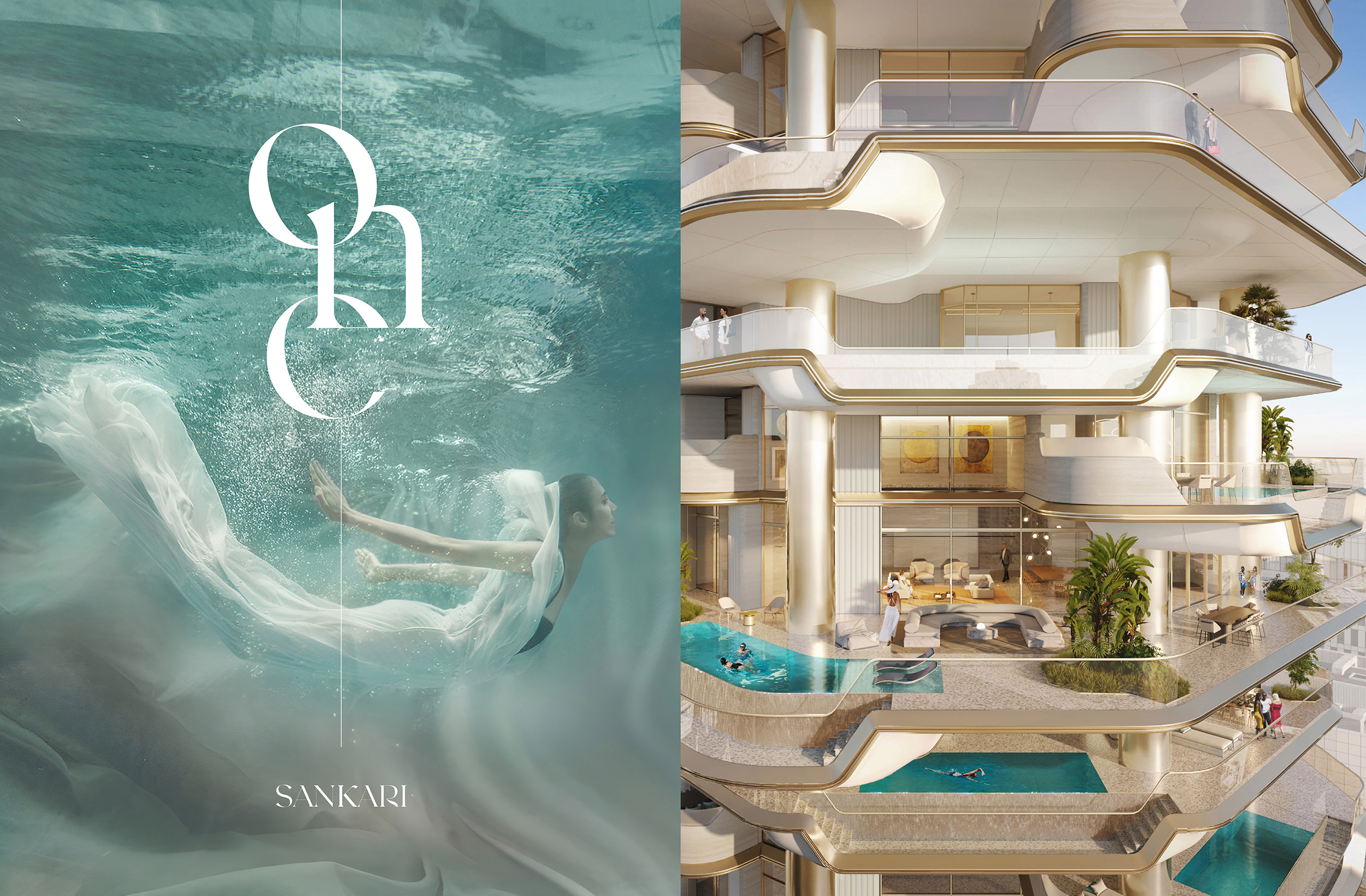
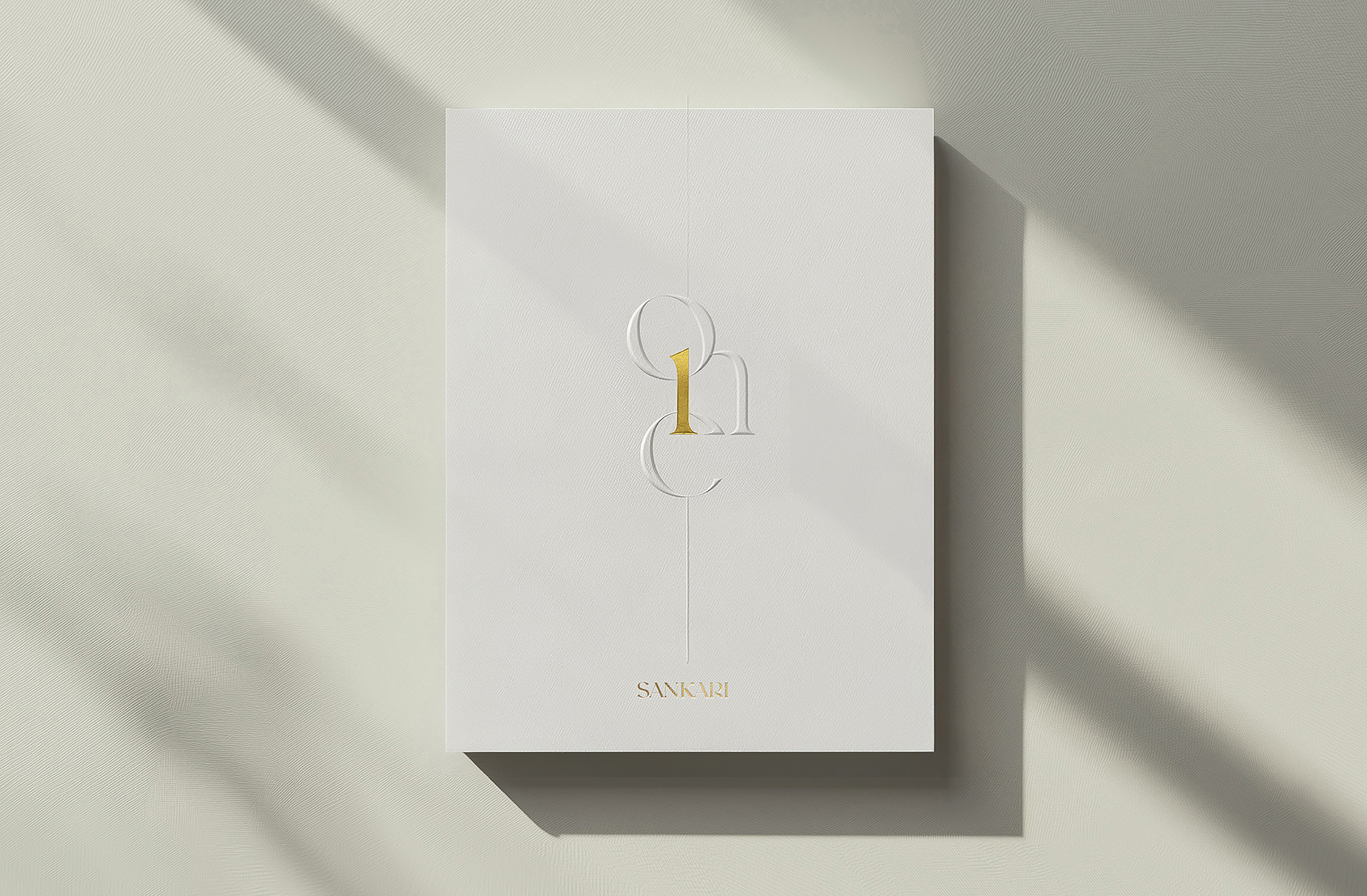
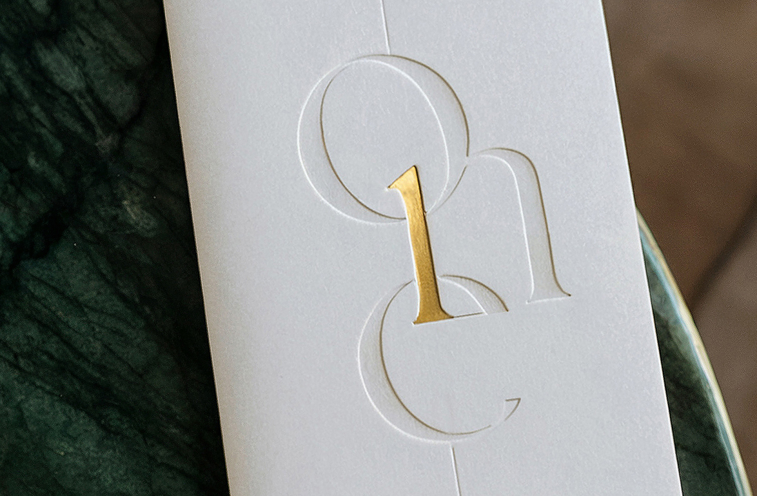
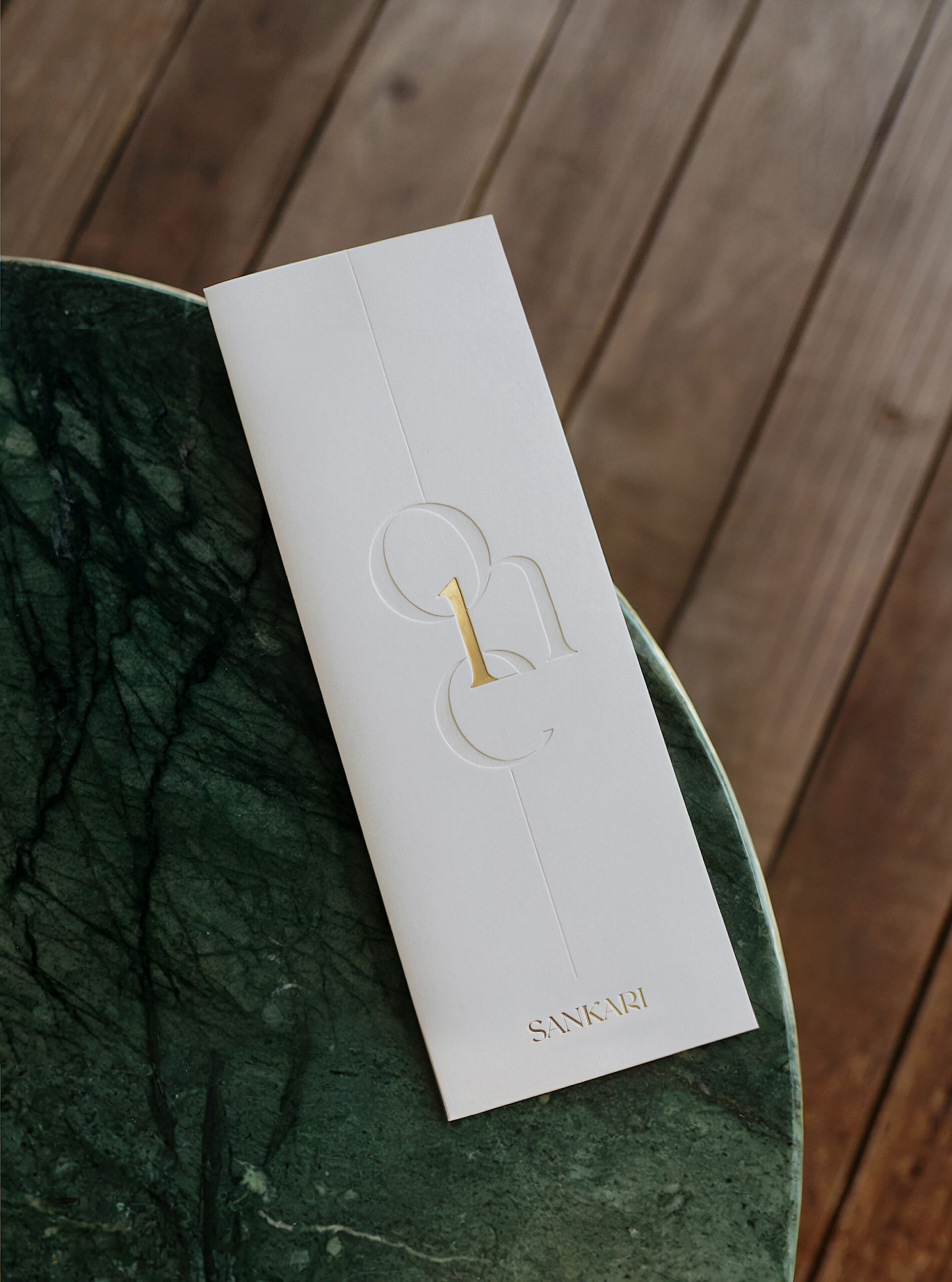
Our visual direction’s celebration of flow was beautifully continued with this wordmark. Crafted using bespoke typography and designed in tandem with the Sankari Properties wordmark, this incarnation features long letter forms inspired by cascading water. This logo gives scope to play with volume as the centralised ‘1’, cleverly designed with the letter ‘n’, can be subliminal when one colour is used, or made a centrepiece when highlighted in gold.
Designed With Dynamism
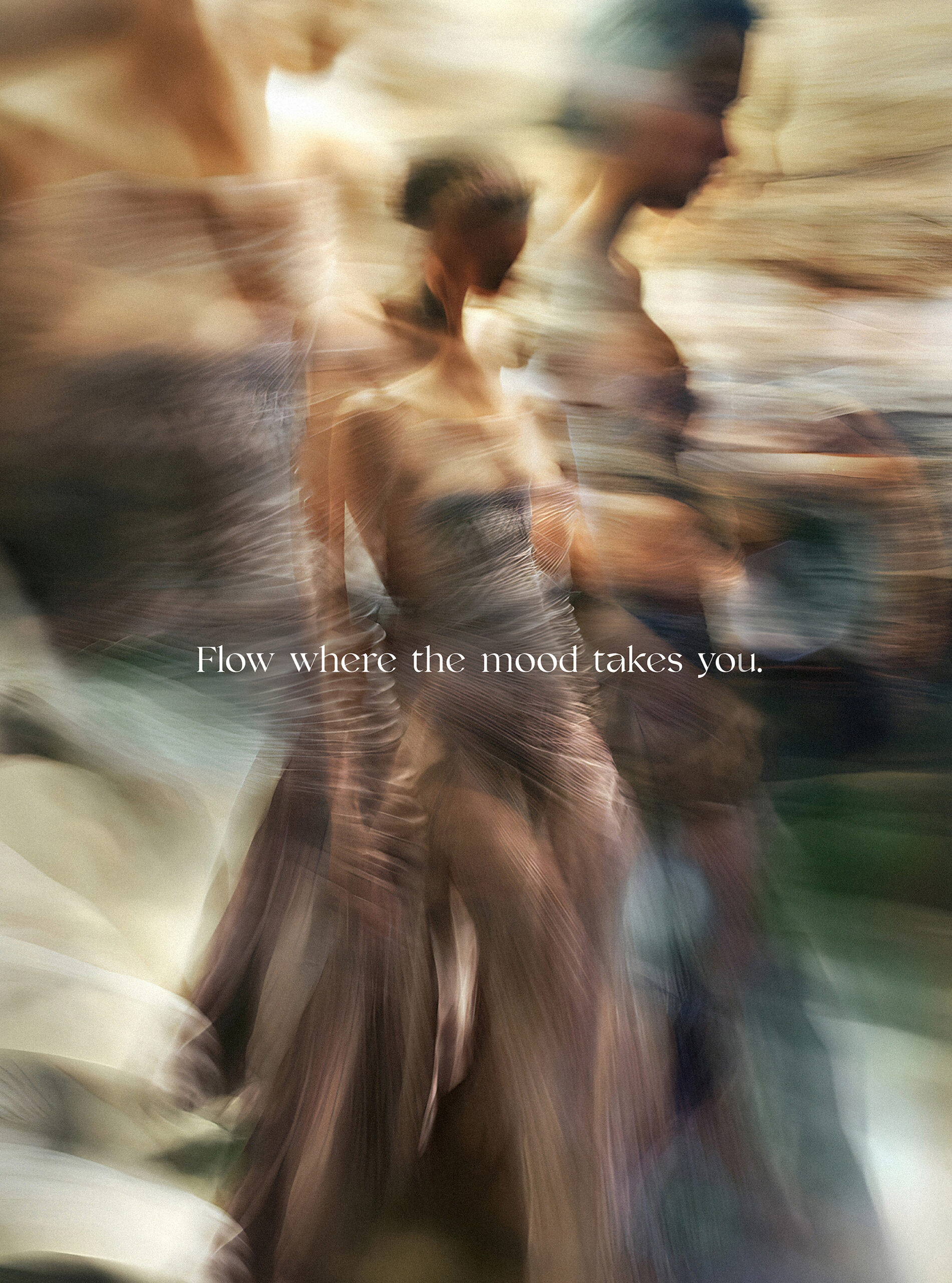
The flow state embodied by a One Sankari address was conveyed with the powerful photography style that is defined by dynamism. There’s a sense of movement clear across all assets, whether through a flowing stream or the ripples on the surface of a pool and this gives the overarching aesthetic an inspiring effect. The brand extends an invitation to a life that reflects your greatest achievements and flows with your energy – a life that exceeds every expectation.