A’Thuraya City’s brand identity and strategic foundation encompassed great significance including the personal pride of His Majesty Sultan Haitham bin Tariq and the drive towards Oman’s invigorated future.
Brand Strategy and Positioning
Brand Narrative
Brand Identity and Visual Language
Brand Book
Print and Outdoor Campaign
Digital Campaign
Outdoor Branding
Experiential and Spatial Design
Read more
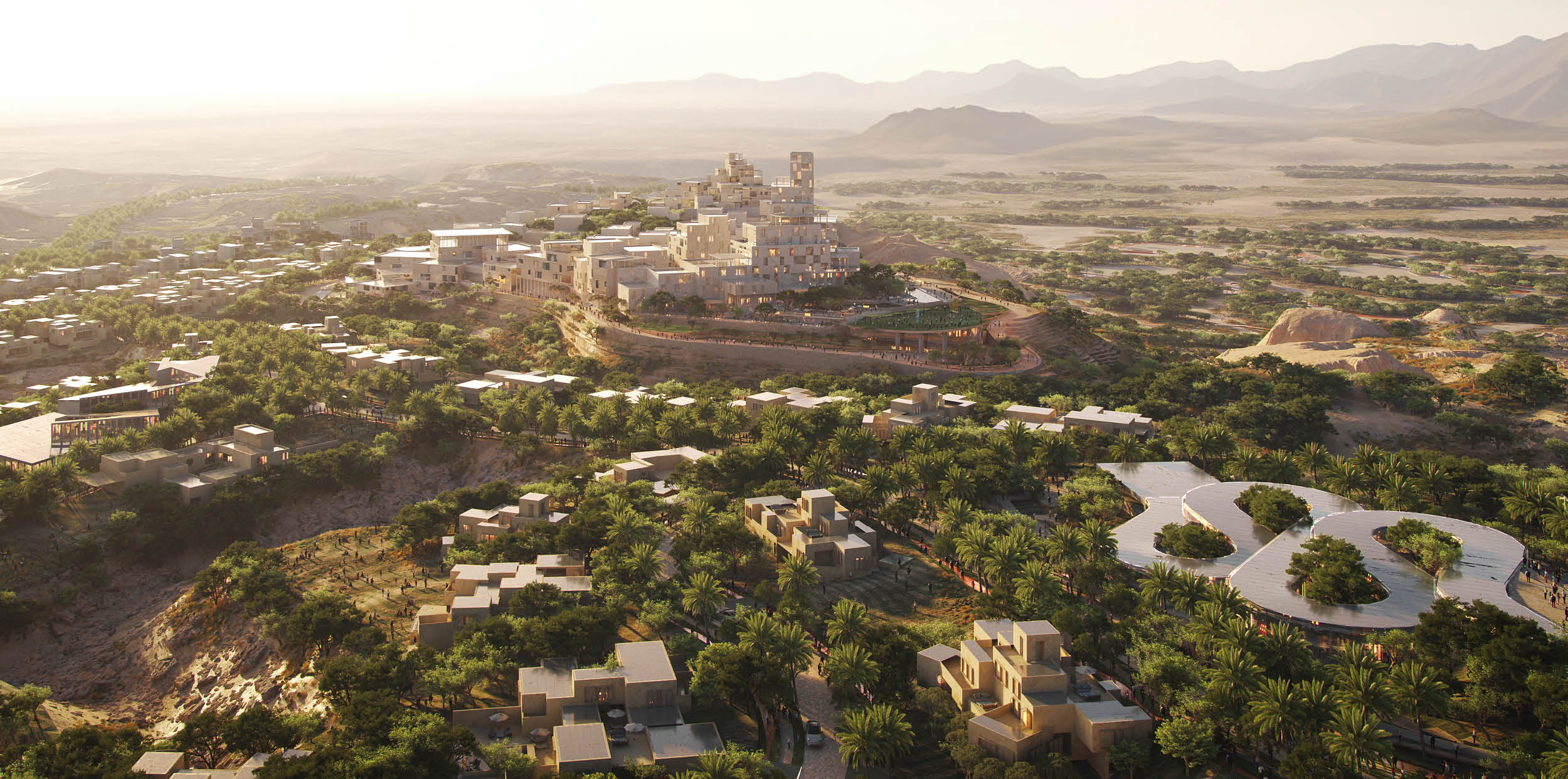
A mountaintop city presenting a new paradigm for natural luxury, A’Thuraya City needed a strategic proposition and creative identity that revealed its sparkle. Carrying the name of one of his beloved daughters, A’Thuraya City is a project of personal importance to Oman’s Sultan Haitham bin Tariq. This, combined with its existence as a district within the highly ambitious Greater Muscat Structure Plan, meant the approach we developed faced greater scrutiny from the highest office of the nation – with direct sign off by His Majesty himself. But, by encapsulating an entirely new vision that showcased excellence without exclusivity, we were able to convey the city’s brilliance and attract serious investment and future-resident interest.
In recognition of the audience needs and unique context, we sought to highlight the levels of excellence MOHUP was pursuing in its creation of A’Thuraya City while ensuring that the brand was within reach for Omanis. We had to redefine the concept of authentic luxury, inspired by context, in order to balance the complexities of the offer. This we achieved with a creative approach that made the mountain the main character, honoured the namesake Thuraya constellation and heroed Oman’s natural beauty and rugged character of the surrounding terrain in colour palettes, typography styles, logo and wordmarks supported by a deeply rooted narrative.
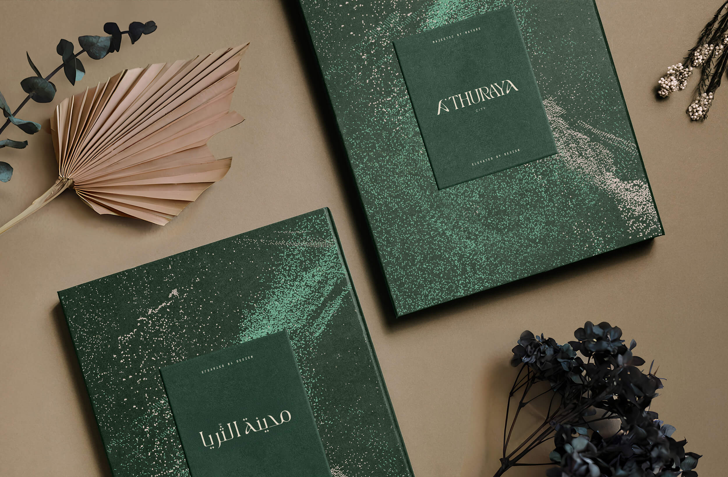
Furthermore, we sought to celebrate Omani spirit and culture, thereby championing a new era of Omani excellence to ensure the expression resonated with the target audience. Not only was this thread woven through the copywriting, but the creative work had a proud Arabic component. Through the development of a contemporary aesthetic for Arabic logos and brandmarks, we not only created a new vernacular specific to A’Thuraya City, but one that elevated the standard of Arabic design across the entire GCC region.
Immediately accepted and approved by MOHUP and signed off by His Majesty, the brand identity we developed for A’Thuraya City represents the powerfully forged collaborative relationship shared by Fifth Estate and this influential ministry. Embraced by MOHUP and Omanis, A’Thuraya City’s brand identity received further validation as it was shortlisted for Best Large Scale Urban Development at MIPIM 2026, the world’s leading international real estate and property trade show. Highlighting our clear crystalisation on the needs of the brand and its audiences, it’s clear that A’Thuraya City’s creative expression exceeded expectations.
Developer: Madinat Al Foutain, Oman
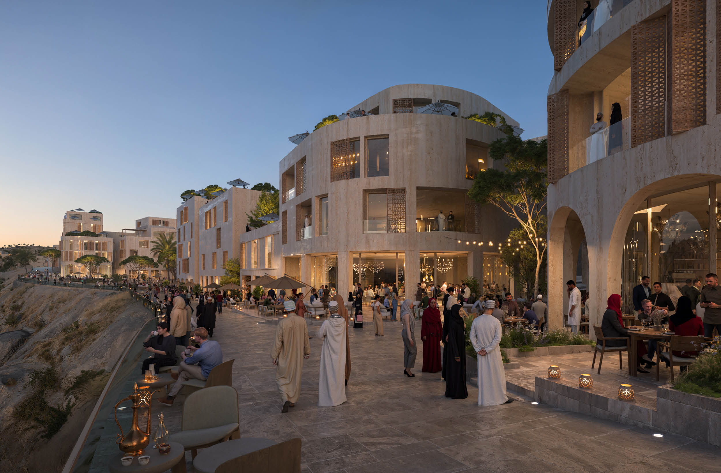
Through our vivid rendering of what the future of this city holds, A'Thuraya City has generated great interest and has been lauded on a global stage.
Brilliantly Bespoke
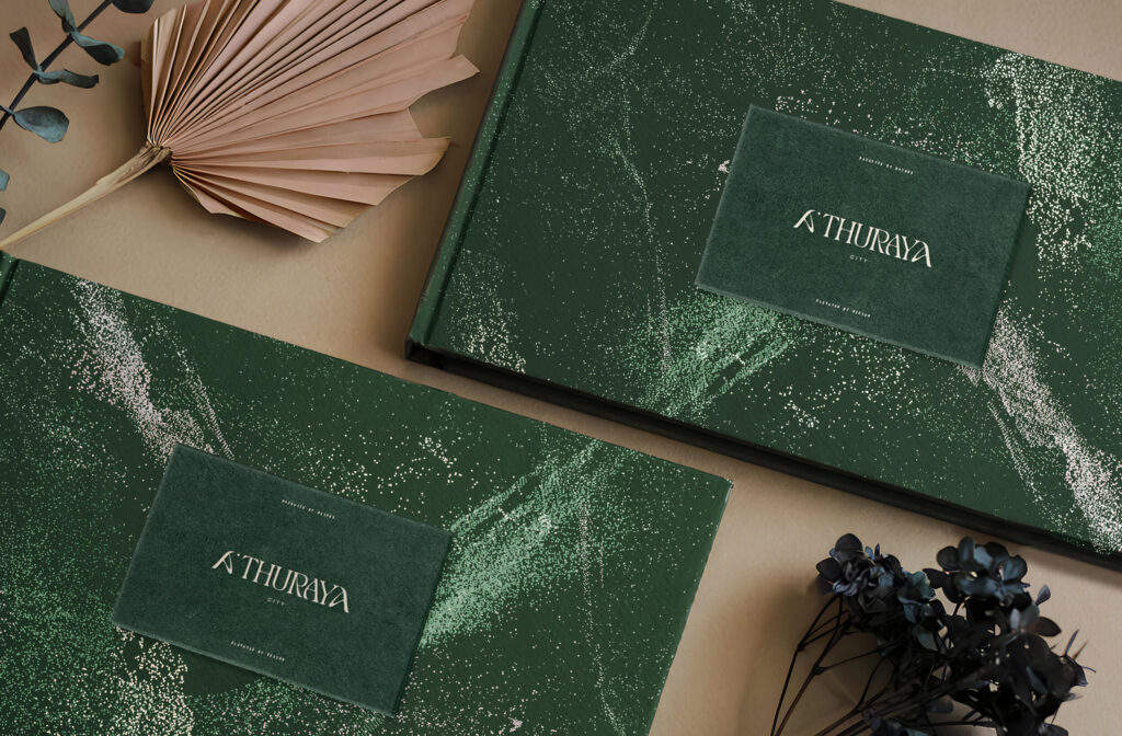
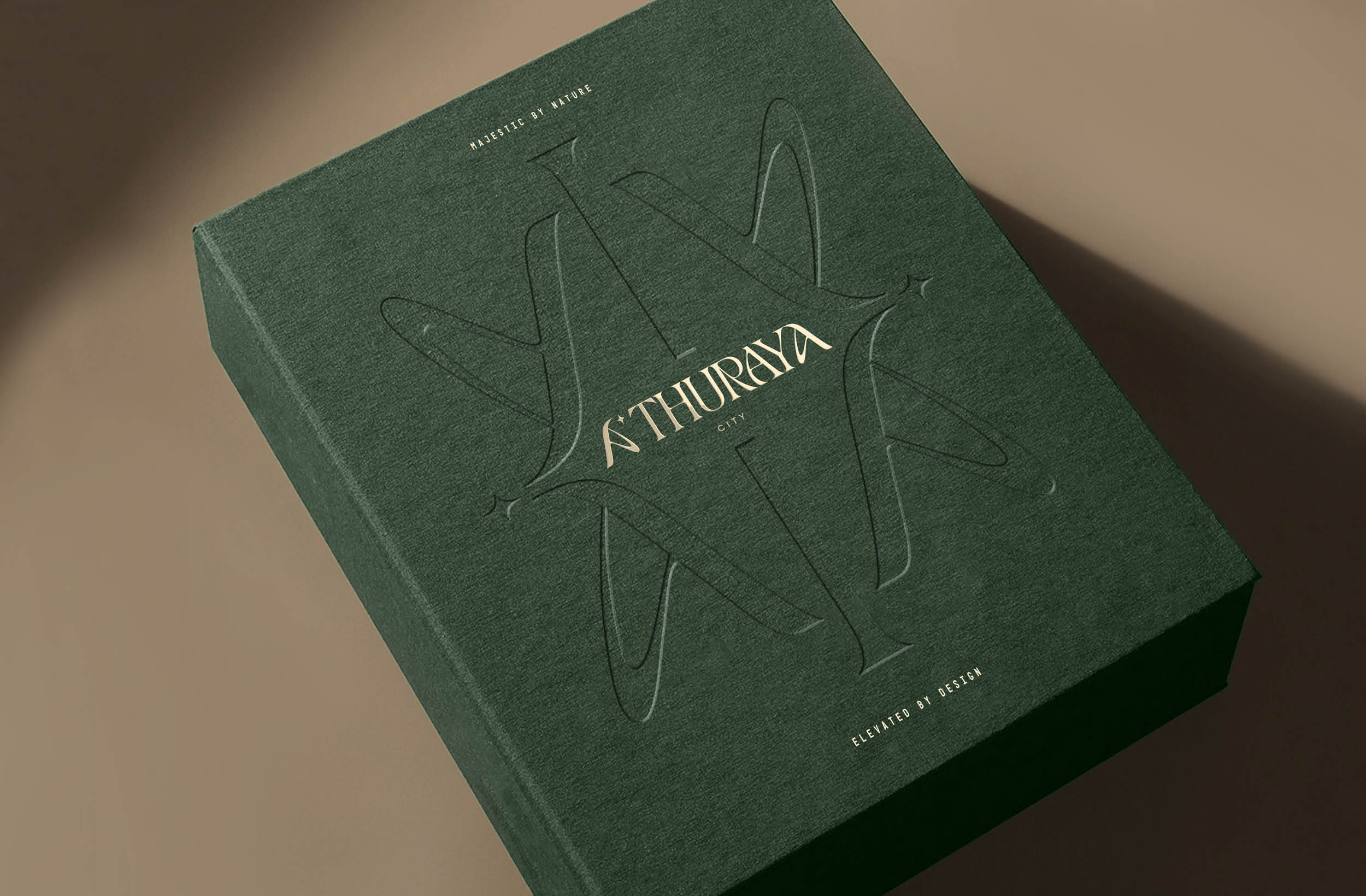
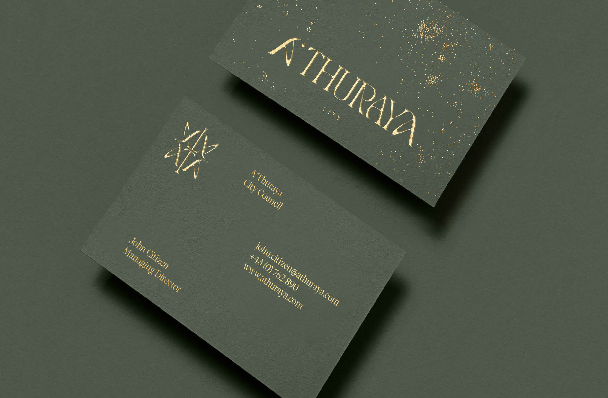
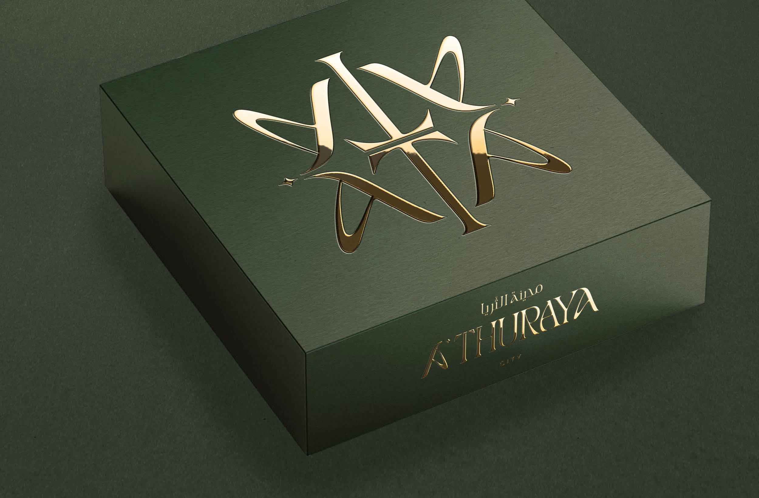
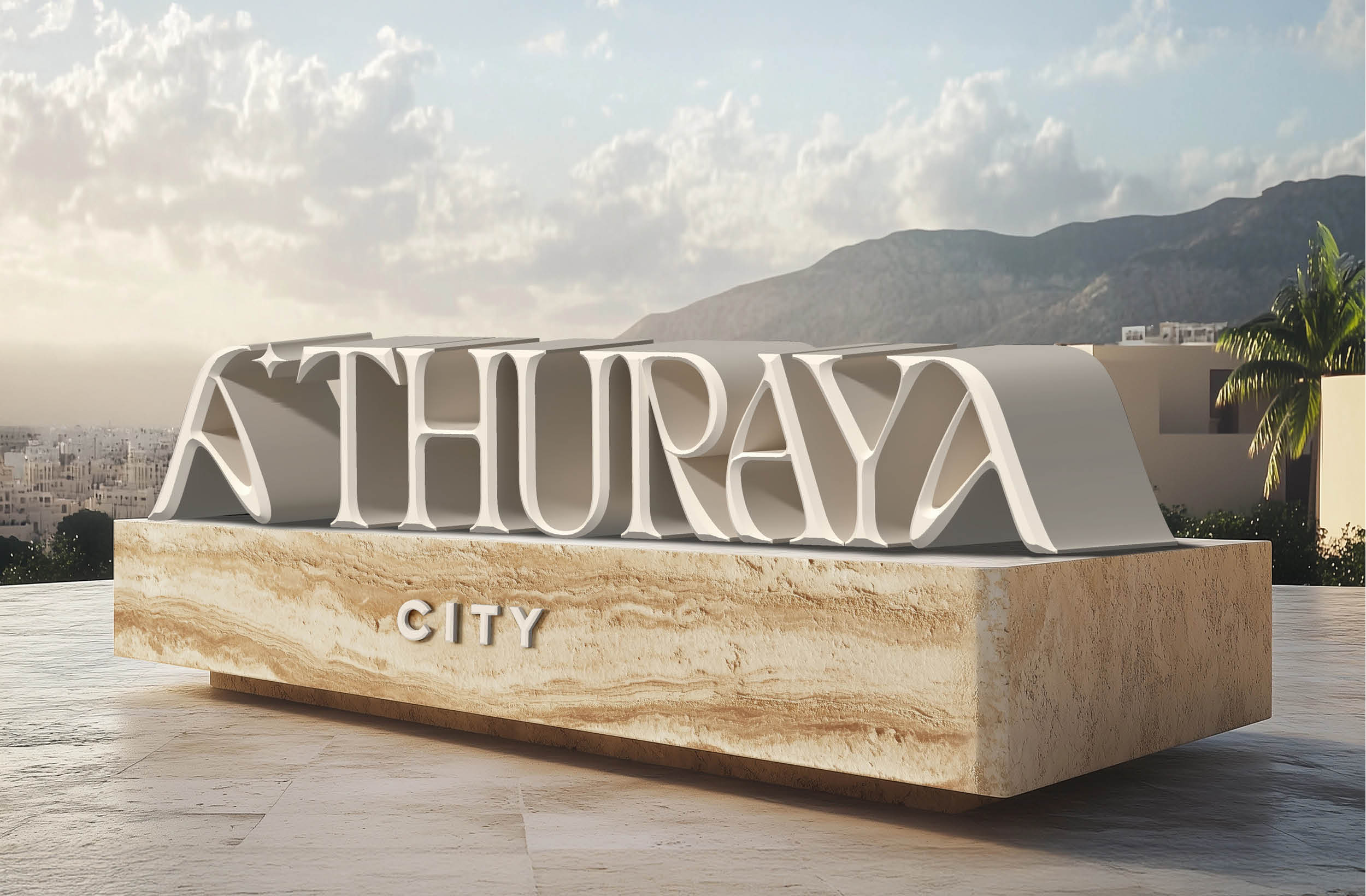
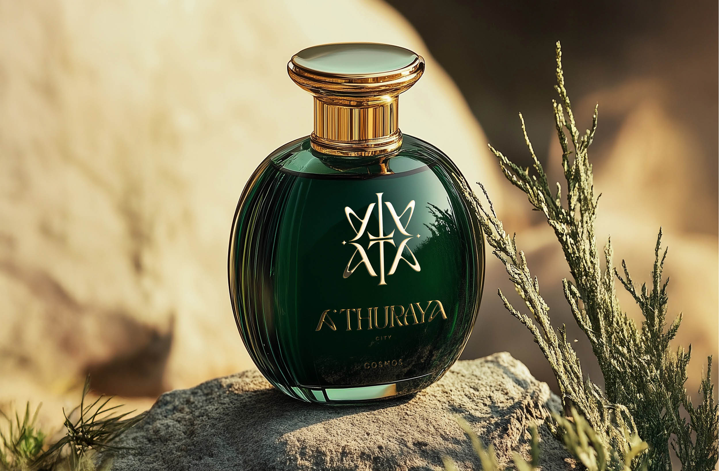
Painstaking care was taken to ensure the monogram and wordmarks encapsulated the richness of the city and its mythology. Here, the monogram showcases the bespoke lettering that leads with elegant, organic lines reminiscent of nature’s curves and the unique reflective ‘A’s form the sides of the mountain’s pedestal. Wordmarks in both English and Arabic carry through the starburst details, honouring the city’s connection to the Thuraya constellation.
Nature is the Muse
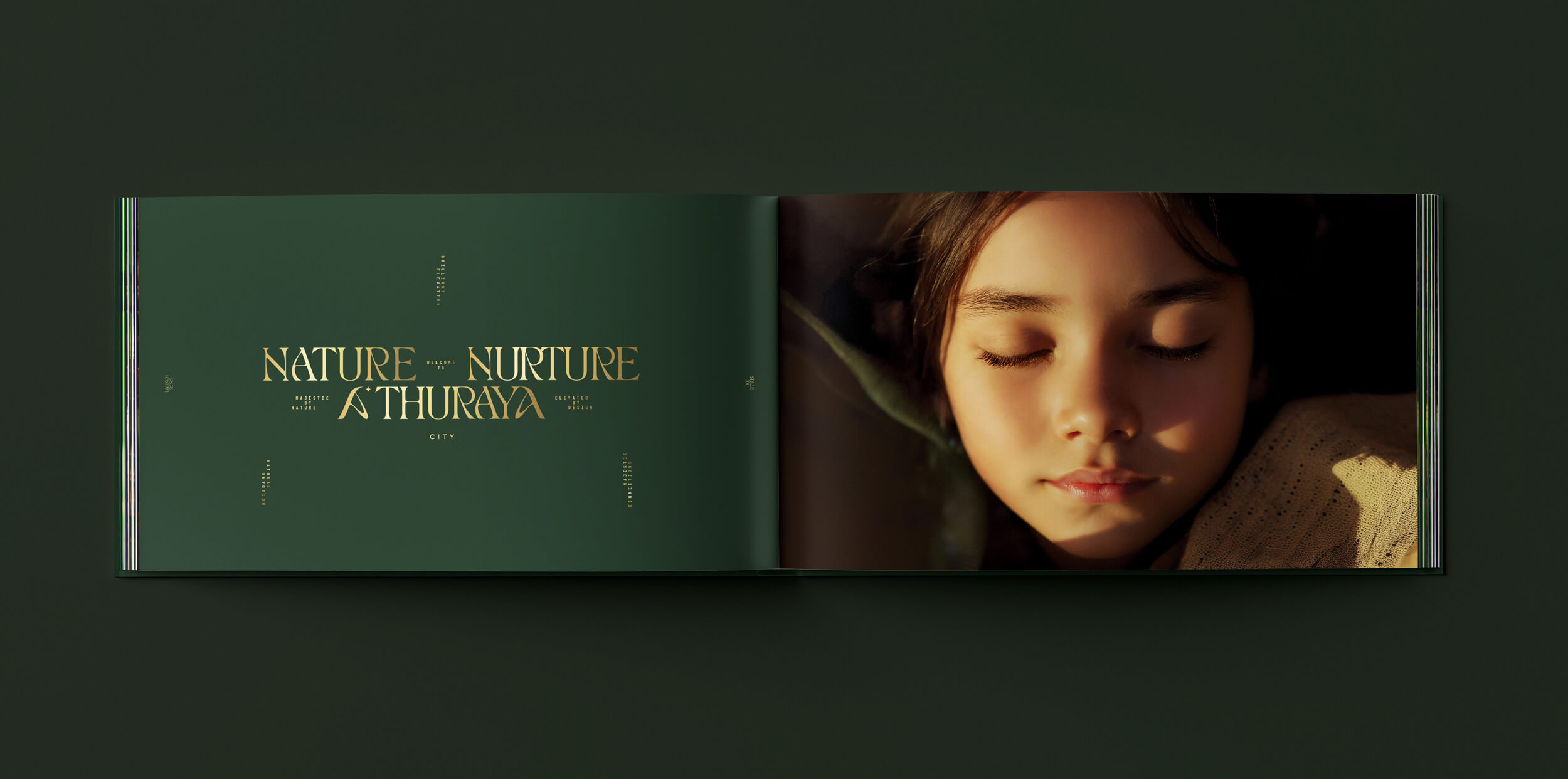
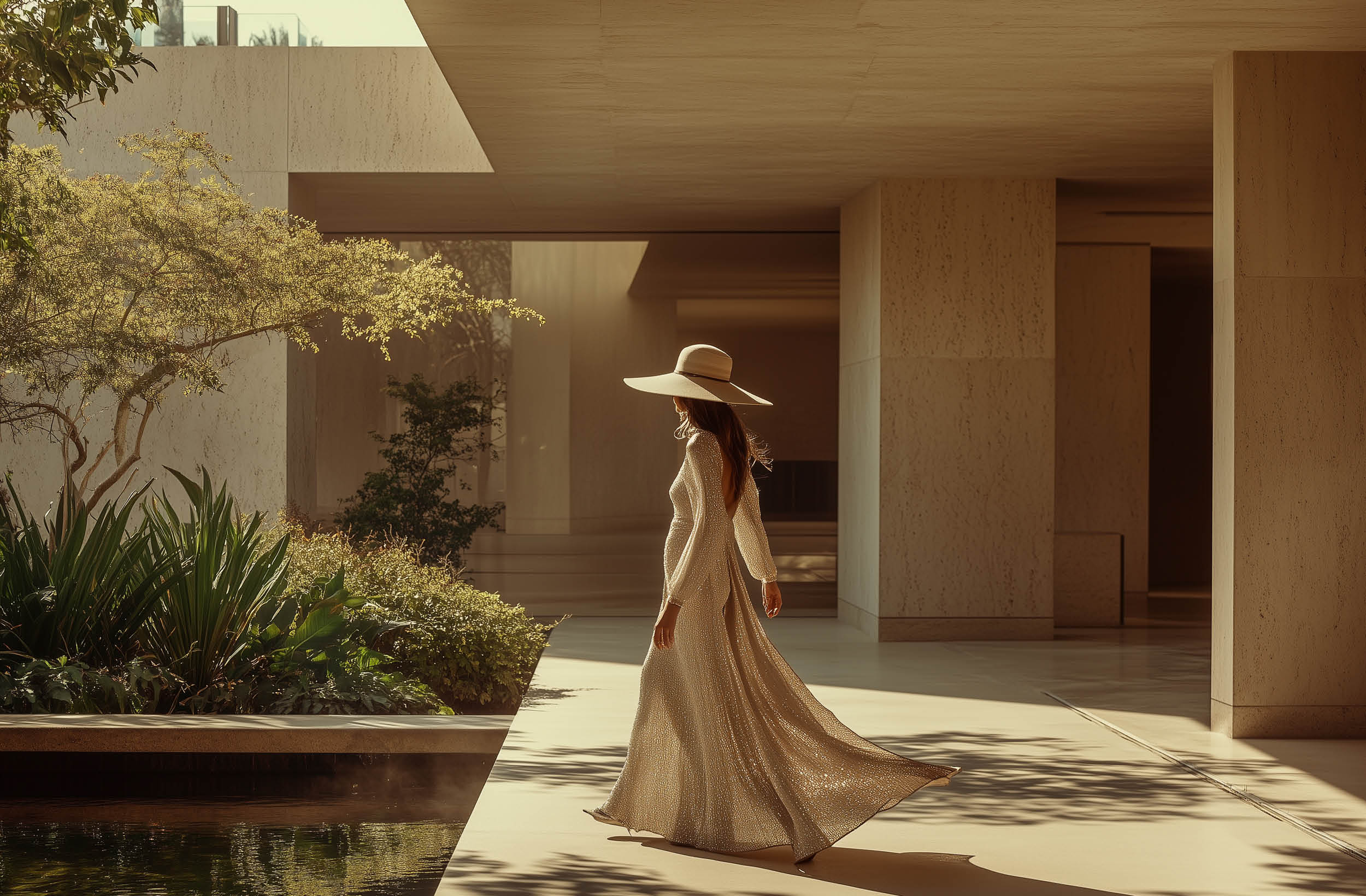
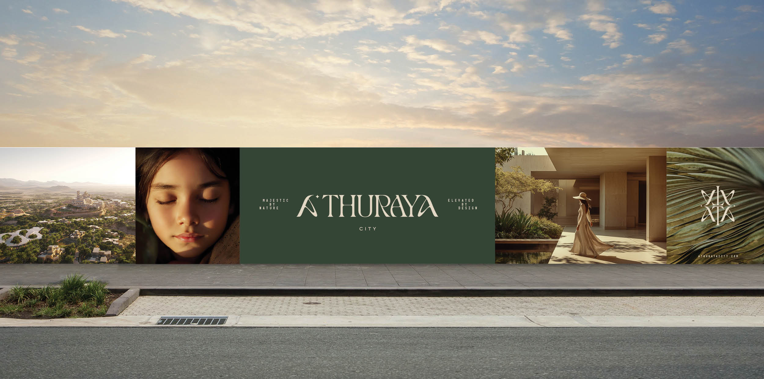
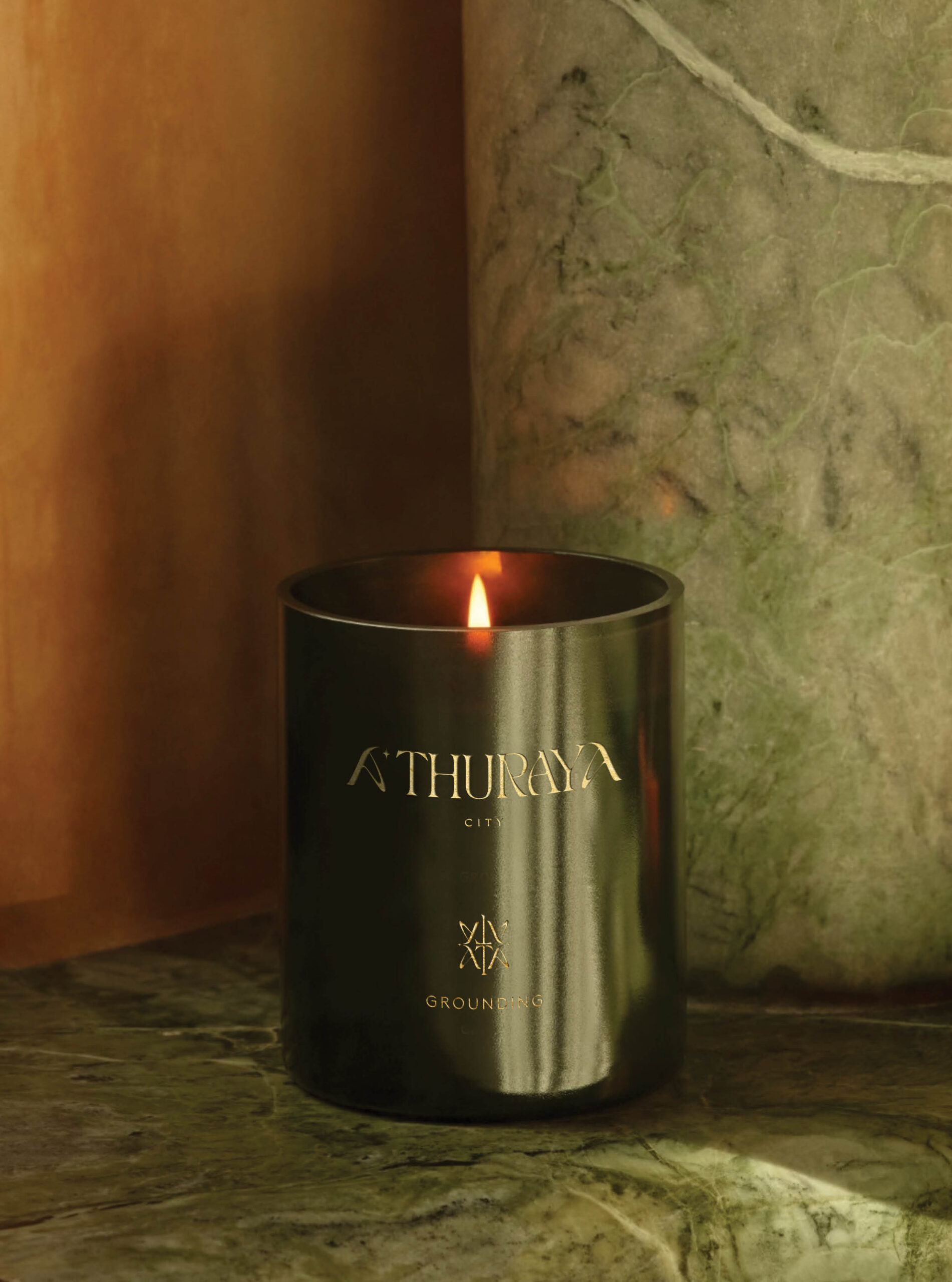
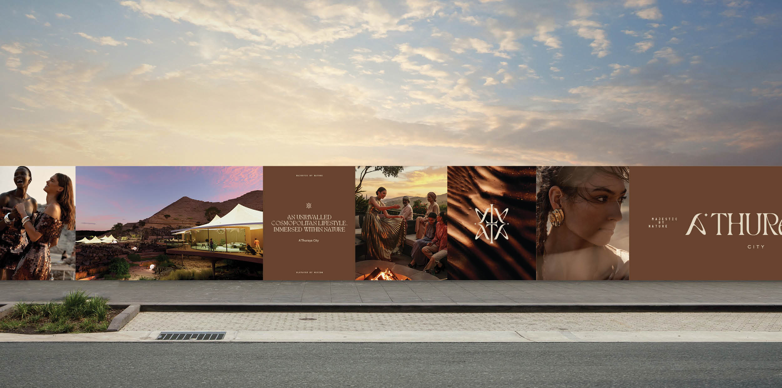
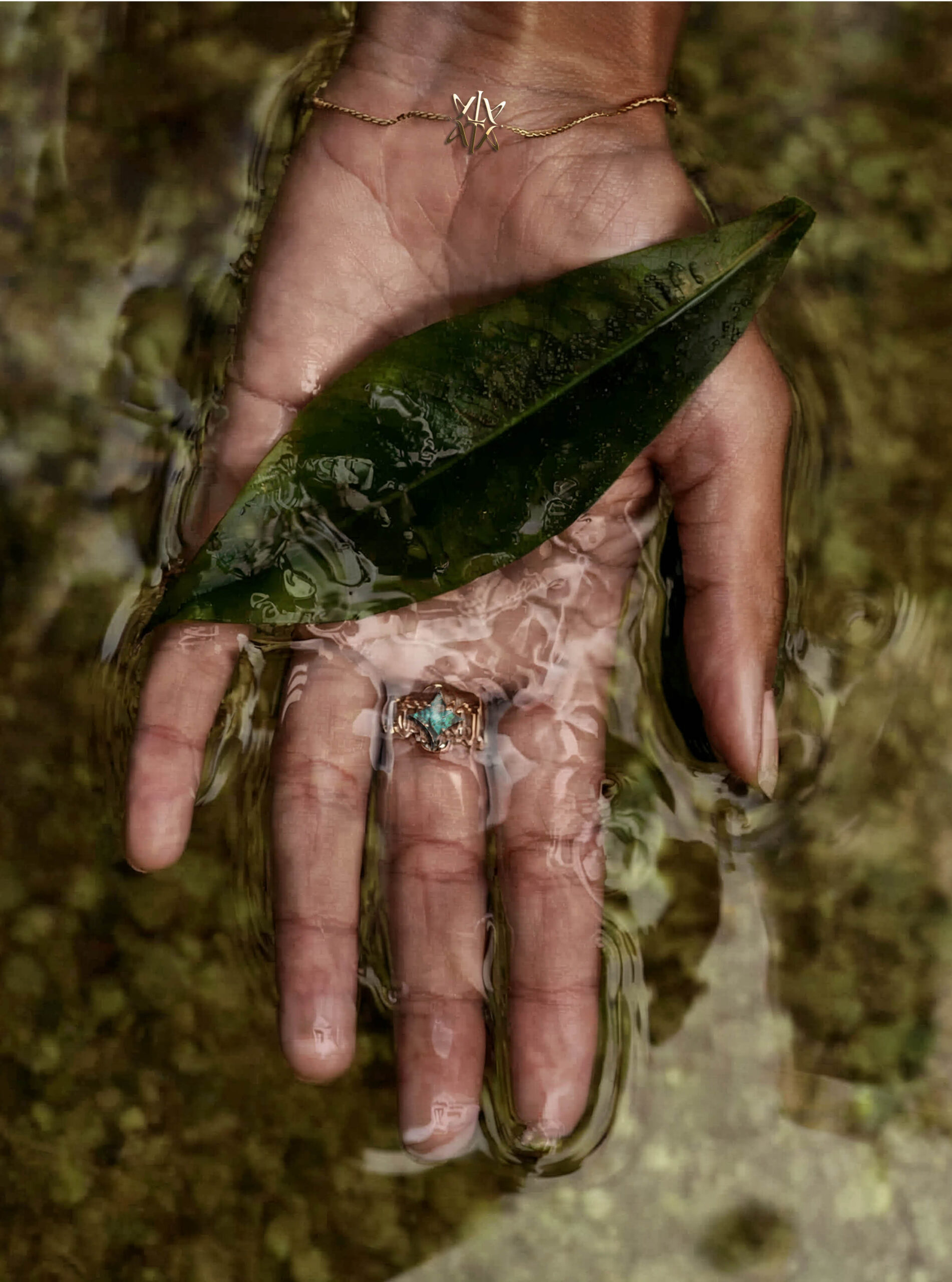
Across all brand collateral, the visual and verbal identity of A’Thuraya City was inspired by context. Creative work comprising colour and texture palettes, vivid and poetic language structures, comprehensive moodboards and photography style development, editorial, social media, digital and outdoor executions and more all looked to the rugged forms, organic tones and connected spirit of the mountain.