
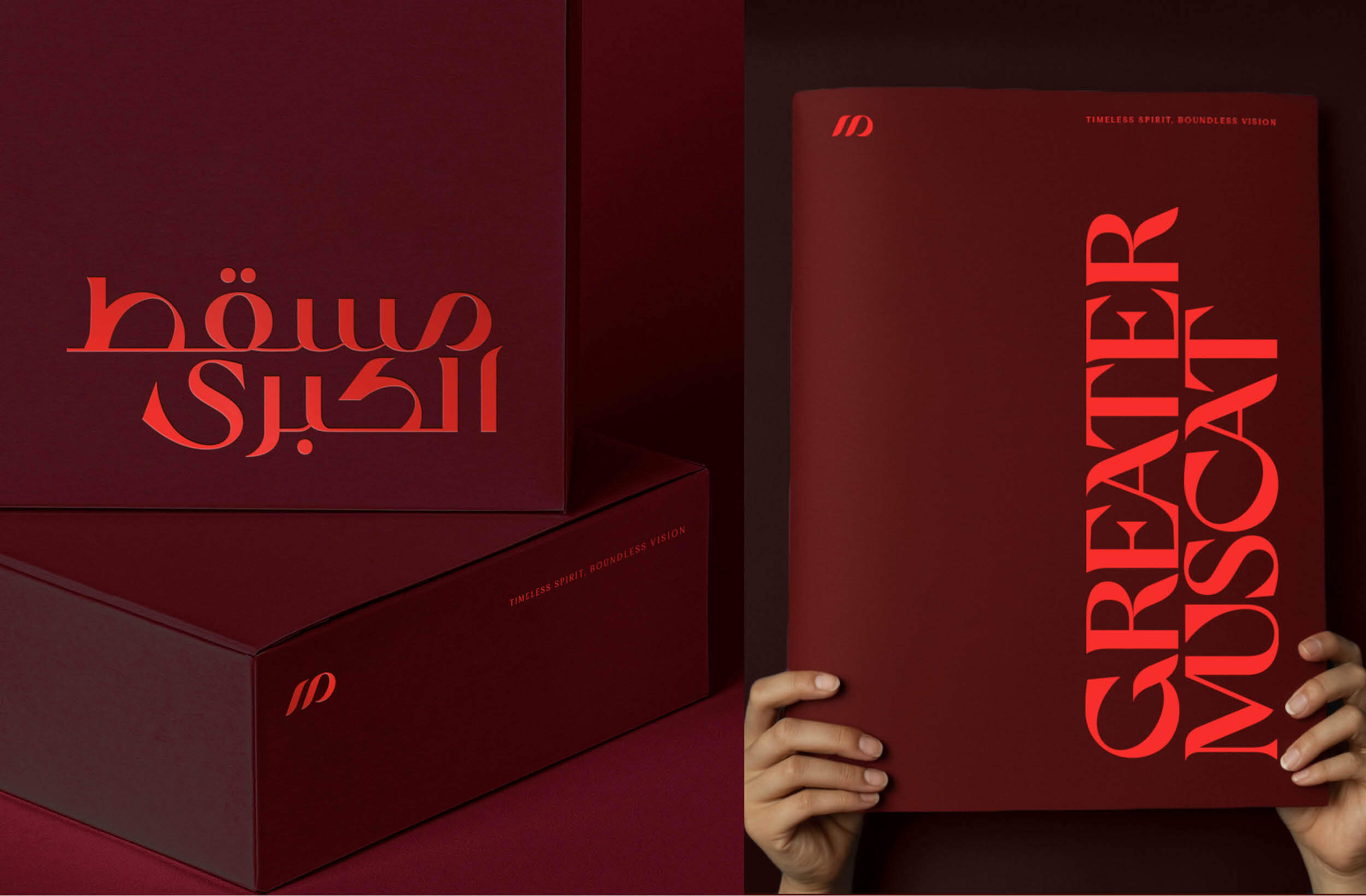
Greater Muscat Arabic and English wordmarks by Fifth Estate
While we’ve worked with clients all over the world, we have a wealth of experience collaborating with brands that seek connection with Arabic-speaking audiences. Throughout these partnerships, we’ve gleaned first hand just how powerful honouring context is – strategically, visually and verbally. Across these projects targeting Arabic-speaking audiences, the Arabic components we’ve developed for brands have been the definitive selling point of our vision rather than an afterthought tacked onto a scope of work.
Fifth Estate managed to embody an entirely fresh take on Arabic design without wiping the slate clean.
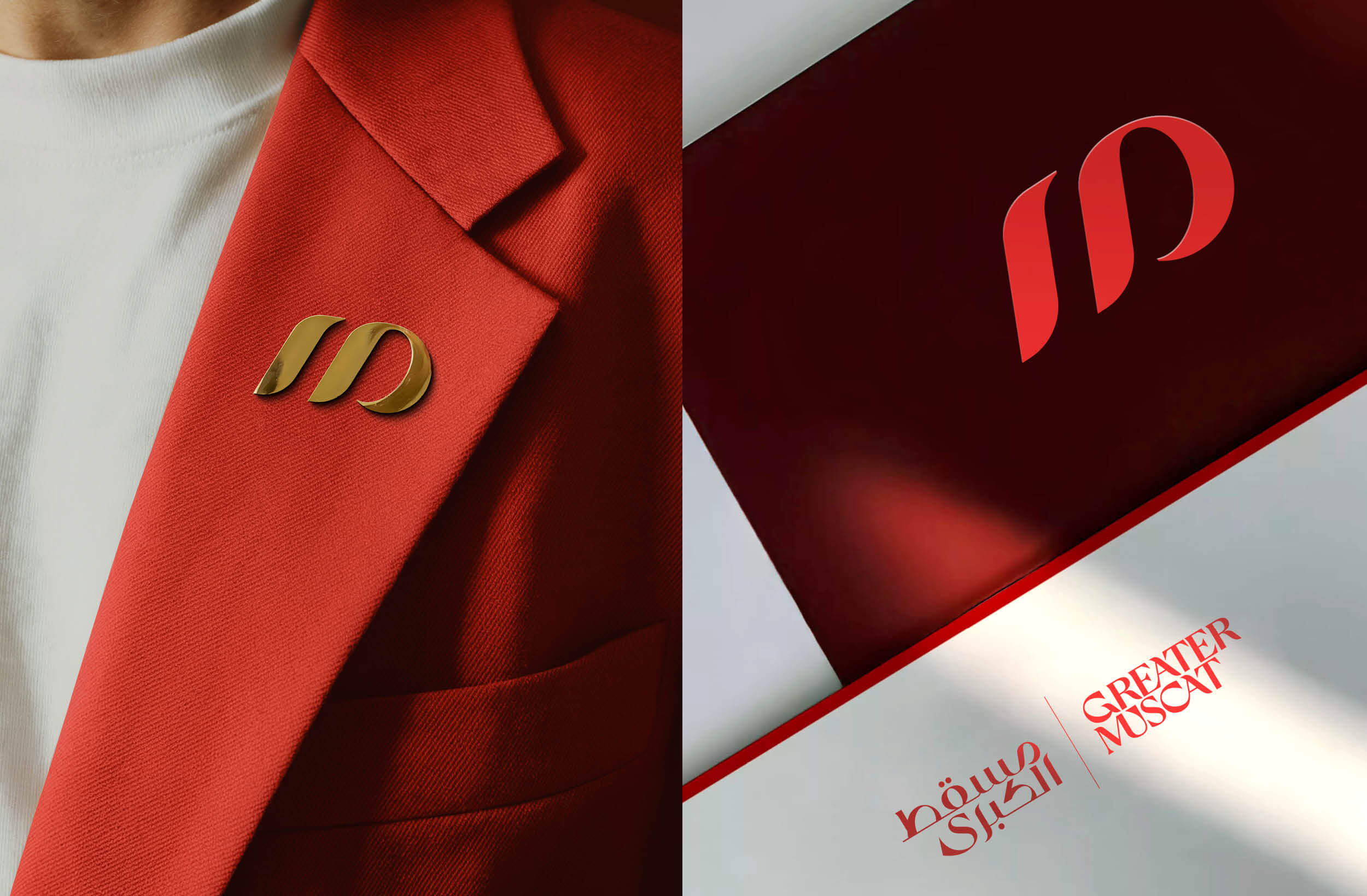
Greater Muscat, a wave of optimism beautifully expressed in one bilingual symbol
Why Context Matters
Our portfolio showcases brands with Arabic creative expression that finds its genesis alongside all elements of the brand’s identity, visual and verbal language, so that every detail exists synergistically in the branded universe. Because when these touchpoints all exist cohesively, every detail complements each other, thereby reinforcing the brand identity in every application.
Understanding context, the status quo of local branding and the vernacular of design that exists at the time of briefing is crucial to refining the approach for future creative expression. To disregard all that has come before and attempt to embed an aesthetic approach that is untethered from tradition, particularly in nation-shaping projects, defies the very brand DNA.
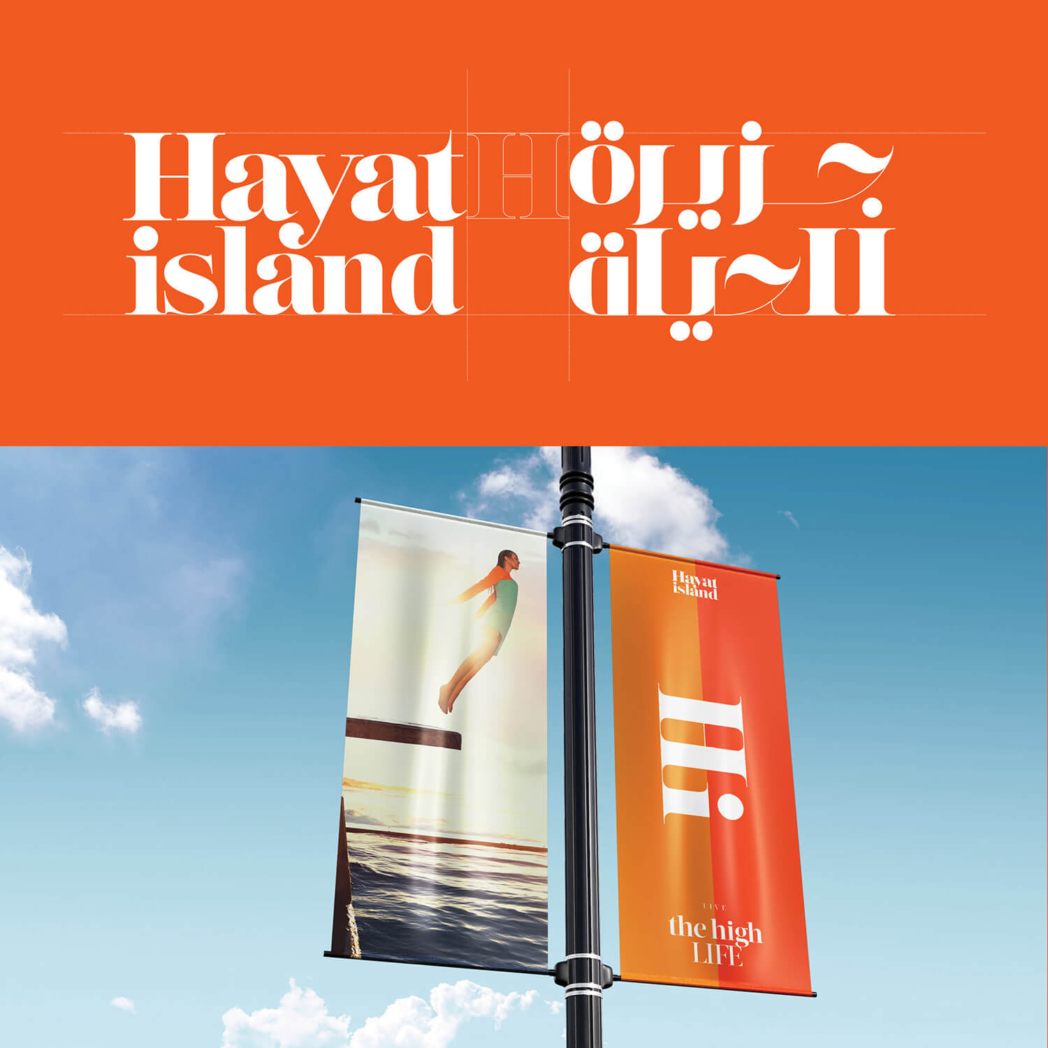
Hayat Island Arabic and English wordmarks by Fifth Estate
A Winning Formula
We have seen this fact validated on numerous projects – specifically those where we anchor the Arabic soul of a development in the artistry of its logo and typography. The first was our comprehensive creative identity development for Ras Al-Khaimah’s Hayat Island, which featured English and Arabic logos. These two complementary iterations showcase synergy in style to reinforce the mythology of the brand and its context, representing mastery of form and devotion to detail too. By going the extra mile to unify these assets, we ensured this brand was legible locally and performed internationally to give Hayat Island serious staying power and put it on the map for global visitors and residents.
This approach gained even greater traction with the suite of identities we developed in collaboration with the Ministry of Housing and Urban Planning (MoHUP) of Oman. In the case of Sultan Haitham City (SHC) – the very first project we delivered for this ministry – the mastering of Arabic-branded elements won over hearts and minds and, in doing so, seamlessly laid the last piece of the intricate puzzle to give the entire brand a well-rounded sense of completion. It showed our client that we respected the culture, honoured the legacy and empowered the vision to see Oman reach its new destiny and, for these reasons, led to further nation-shaping collaborations.
Pursuing this same strategy, we developed the branding of Al Jabal Al Aali. This awe-inspiring mountaintop city was honoured with an English wordmark channelling the towering peaks and cragged edges of the terrain, as well as a complementary bespoke Arabic wordmark that was painstakingly created to convey the rhythmic synergy of the English iteration, identifying each touchpoint as two halves of a whole.
The volume was turned up again for our creative exploration of the immensely important Greater Muscat Structure Plan. Leading with agility and ingenuity, we created a bespoke bilingual monogram that is legible as an English and Arabic letter and reads as a palindrome. The Arabic wordmark mirrors the strokes and angles of the English wordmark and, from those features, bespoke icons and window graphics were created – these forms nodding to traditional Omani architecture. When presented in conjunction with the colour palette and photography style that heroes the bright colours central to Omani culture that are lifted by complementing tones selected to refresh and contemporise the overarching aesthetic, there’s a sense of treasuring the past while driving optimistically forward.
Greater Muscat itself comprises numerous districts, including the exceptional A’Thuraya City, which we also developed the encompassing brand identity for. Its context-rooted creative expression honoured the star-grazing mountaintop location in every iteration, but its English and Arabic wordmarks represent a mastery of bilingual synergy. The proud ‘A’ of the English iteration channels the mountain’s towering summit while a mirrored character also appears in the Arabic wordmark to ensure this same value and artistry is tangible in each. Furthermore, the diacritics that appear as twinkling stars in both designs not only reinforce the connection to the Thuraya constellation but incorporate another memorable detail that unites each vital component of the brand so it shines and allures international audiences with an identity that transcends language.
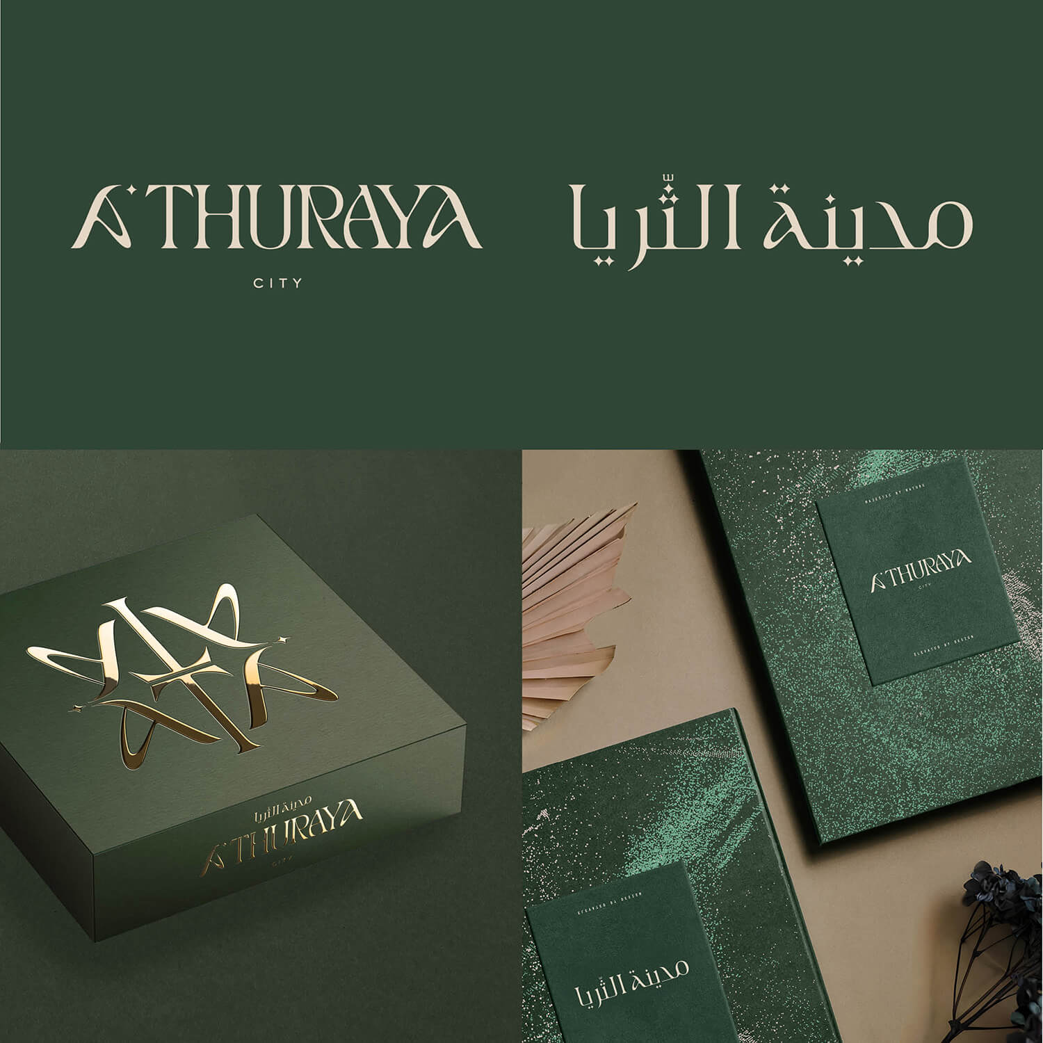
A’Thuraya City Arabic and English wordmarks by Fifth Estate
Why This Approach Works
This approach was not only ground-breaking for MoHUP, but the response across the GCC was clear: Fifth Estate managed to embody an entirely fresh take on Arabic design without wiping the slate clean. With each respective project, Fifth Estate crafted an aesthetic that celebrated the best of the status quo while invigorating the offering to ensure international legibility and acclaim. The overwhelming embrace of these masterplan communities and their multitude of assets delivered on the brief, yes, but it further validated the strategic platforms we developed for each project. Their success acts as a litmus test, proving that the foundation is so strong that each asset and touchpoint we created in alignment with its principles can be flexed and adapted to meet the needs of every application far beyond launch. It again highlights the dividends paid when brands invest in strategy to inform the creation of tangible novelty – winning hearts, minds, funding and trust simultaneously. And this is something that rings true in every language.
Frequently Asked Questions
Does Fifth Estate specialise in Arabic branding?
Fifth Estate does not specialise in Arabic branding, but many projects in its portfolio target Arabic audience segments. For this reason, Fifth Estate has developed Arabic iterations of English logos and wordmarks to ensure international legibility.
What projects has Fifth Estate worked on in Oman?
Fifth Estate has worked on many projects in Oman including Al Mouj Muscat, Sultan Haitham City, Al Jabal Al Aali, A’Thuraya City and Greater Muscat Structure Plan.
How has Fifth Estate reinvigorated Arabic branding?
Fifth Estate’s creative process involves deep immersion in context, looking for opportunities to extrapolate from the status quo of visual identities to create expressions that honour legacy while existing as contemporary visions of the future.


